UX IS FUNCTIONALITY AND FUNCTIONALITY IS BEAUTY  
 Redesign Chemist Warehouse App

Chemist warehouse is the no. 1 online pharmacy retailer in Australia. The Chemist Warehouse brand is part of the Chemist Retail Group. The first store opened in Melbourne in 2000 and currently has over 350 retail stores nationally, growing rapidly. 

Reviews: 
  • The App has a major bug 
  • Online shopping VS medications 
  • Brilliant App 
Rating
2/5

Challenge

Discover the pain points of the current app and propose solutions to improve user experience. The business goal, revenue model, and target audience of the Chemist warehouse app and comparing the reaction to the MedAdvisor app as the competitor.

Strategy

Process For the initial user research, I conducted guerrilla usability testing to understand the current problems. During the synthesis phase, I used affinity mapping to analyse pain points and determine priorities. Then I generated task flows to understand where in the process users were having troubles, and created Lo-Fidelity drafts and Hi -Fidelity clickable prototypes. In the end, I was able to validate with users and confirm the pain points are solved by the redesign.

Persona

Four users involved to uncover pain points while using the mobile app. Users have been asked to use the Chemist Warehouse and MedAdvisor app and record their feedback. Users have been asked to use the MedAdvisor. Q & A (Compare and fill the questionnaire).

Idiation
Based on the study here are the 5 problems I decided to focus on Ideation

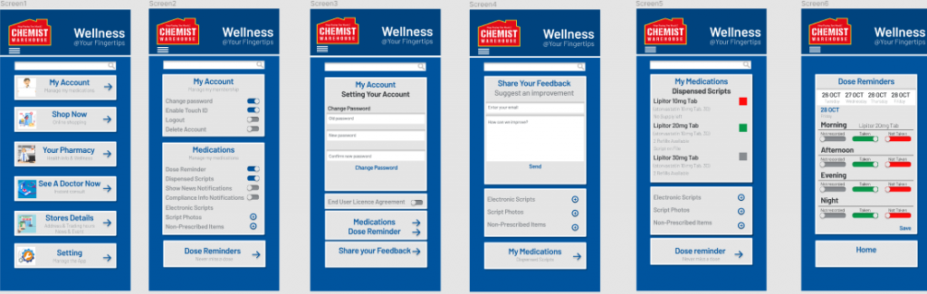
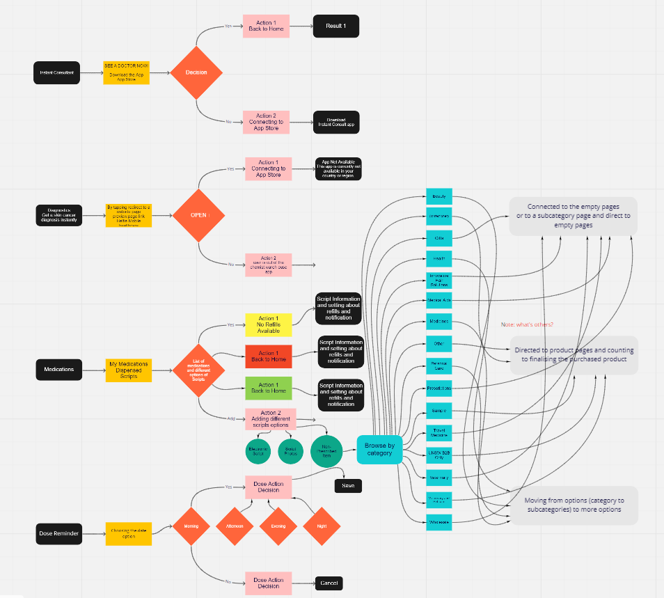
With respect to the company goals in mind, the prototype improves the pain points of the app by focusing on simplified navigation to serve the purpose, account management, medication management, and pleasing presentation. 
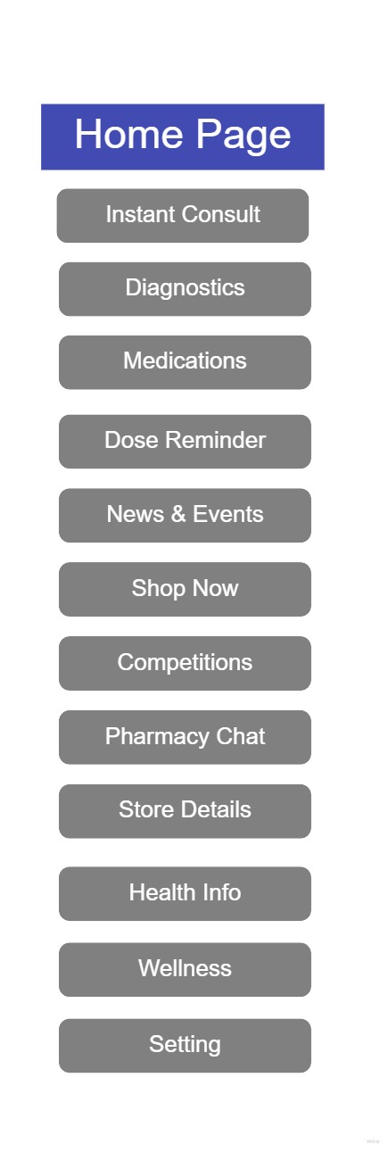
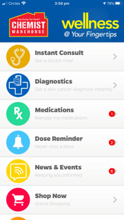
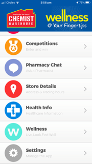
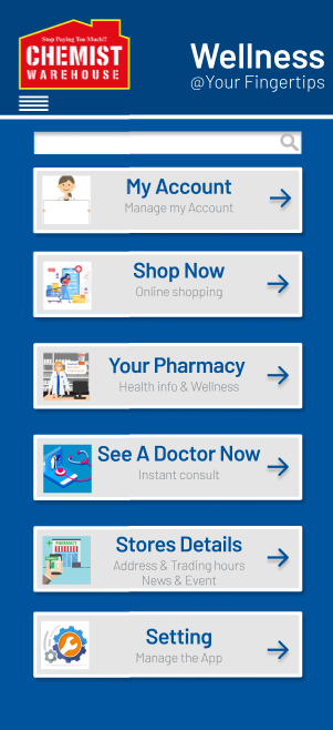
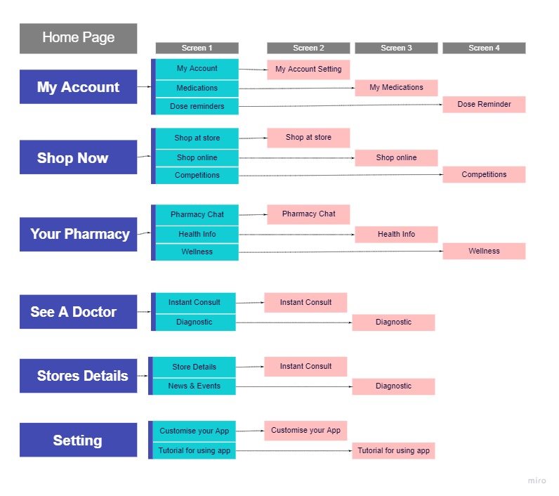
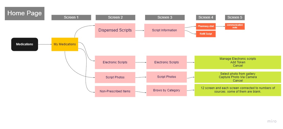
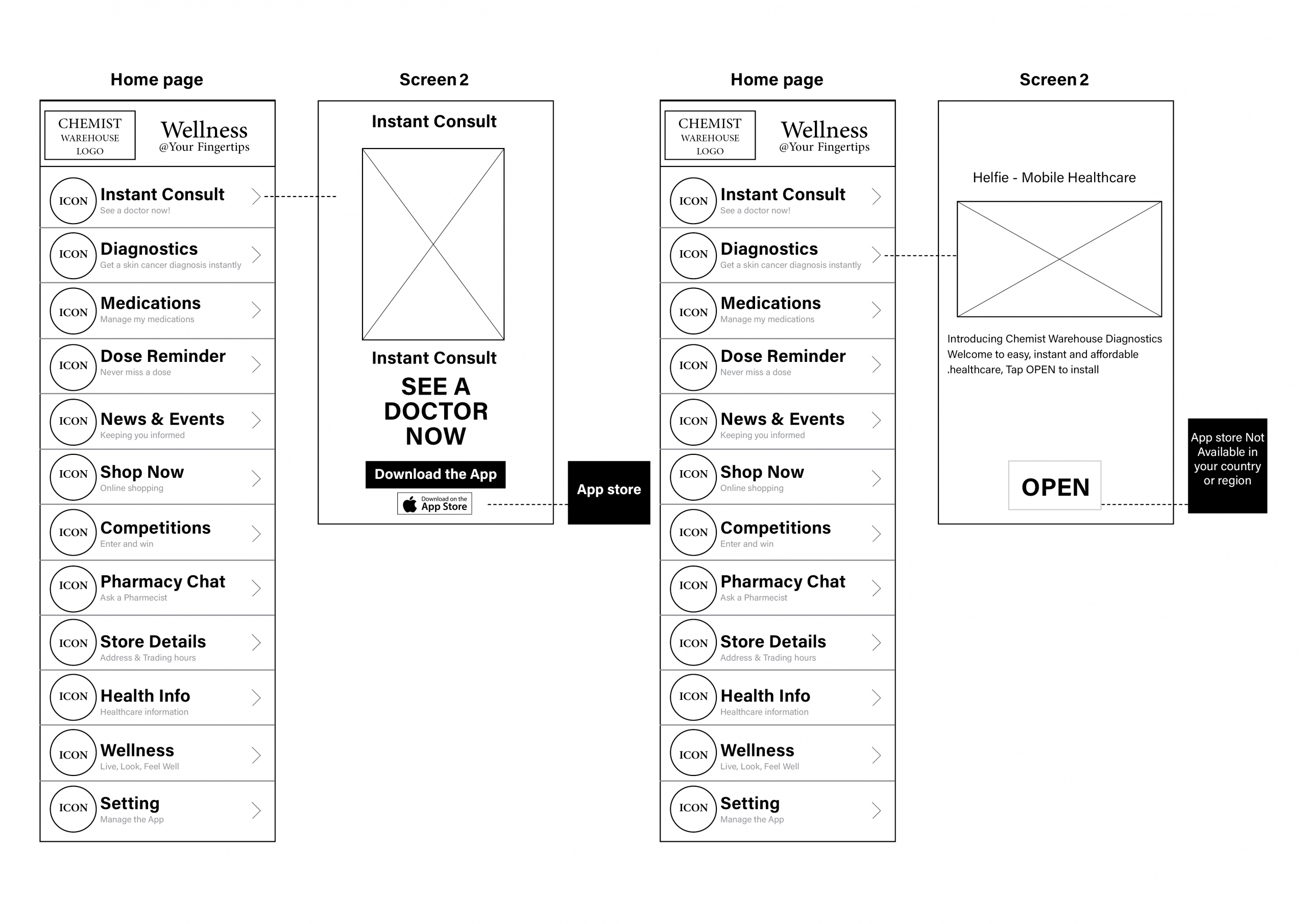
Categories menu and reduce from 12 to 6.

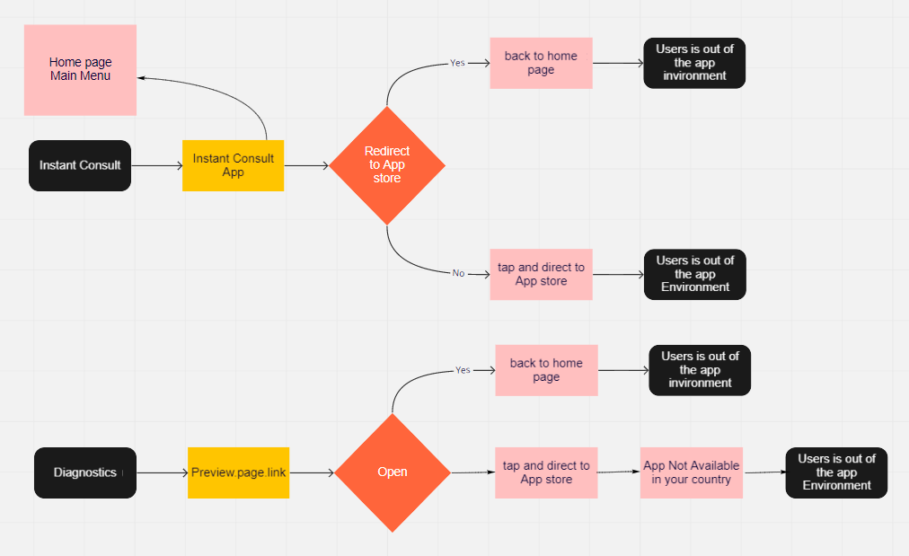
Reduce journey time and hassle from screen to screen to avoid the user’s disconnection from the app. 
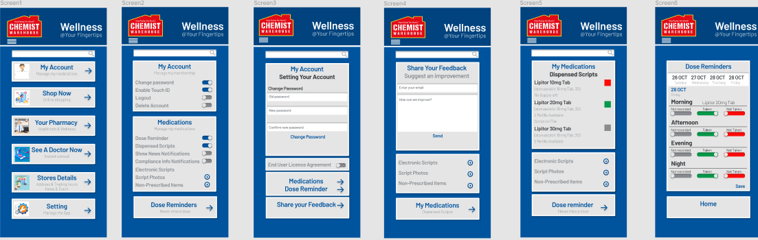
Applied the same design strategy on each page to make it unified and related.

Find professionals options are not serving the purpose. Second option is redirecting to a web page, by pressing on open the user is redirected to another app which is not available in Australia.

Health info is redirecting to another app.

Affinity Map

I synthesised my finding under four categories based on the main business functions of the chemist warehouse app.

  1. Find professionals 
  2. Medication management 
  3. Reminder platforms 
  4. Shop products
Categorize the menu and reduce from 12 to 6.  Ideation
Categorize the menu and reduce it from 12 to 6.  Ideation
Reduce journey time and hassle from screen to screen to avoid user’s disconnection with the app.  Ideation
Concentrating on the user’s account, Medications, and Dose reminder to fulfill the company’s statement.  Ideation
Prototyping

Testing Phase

Validation

With respect for the company goals in mind, the prototype improves the pain points of the app by focusing on simplified navigation to serve the purpose, account management, medication management, and pleasing presentation. By unifying app categories, applying the same design strategy and shifting options from 12-6 slots, users found it not only easier but more efficient to use when experiencing the app functions. Additionally, the newly sophisticated categories now refrain from exiting the base app and withhold all significant items in organized sections of the app itself; this was a favored feature amongst users who examined the prototype. Overall, the visual identity and essence of the app concept and purpose have not been changed, rather being placed in a presentable and easier format that would prove as helpful to the majority of user demographics.

Tools

Used

Figma
Mirror
Photoshop
Illustrator
Indesign
PowerPoint
My Role 

UX Designer

Key Contributions 

Project Management

Concept Idiation

Competitive Research

User Research

Interaction Design

Prototyping

Animation Design

© 2019 Animotion Design Studio

Start typing and press Enter to search

Shopping Cart